Funcesp Brand Redesign
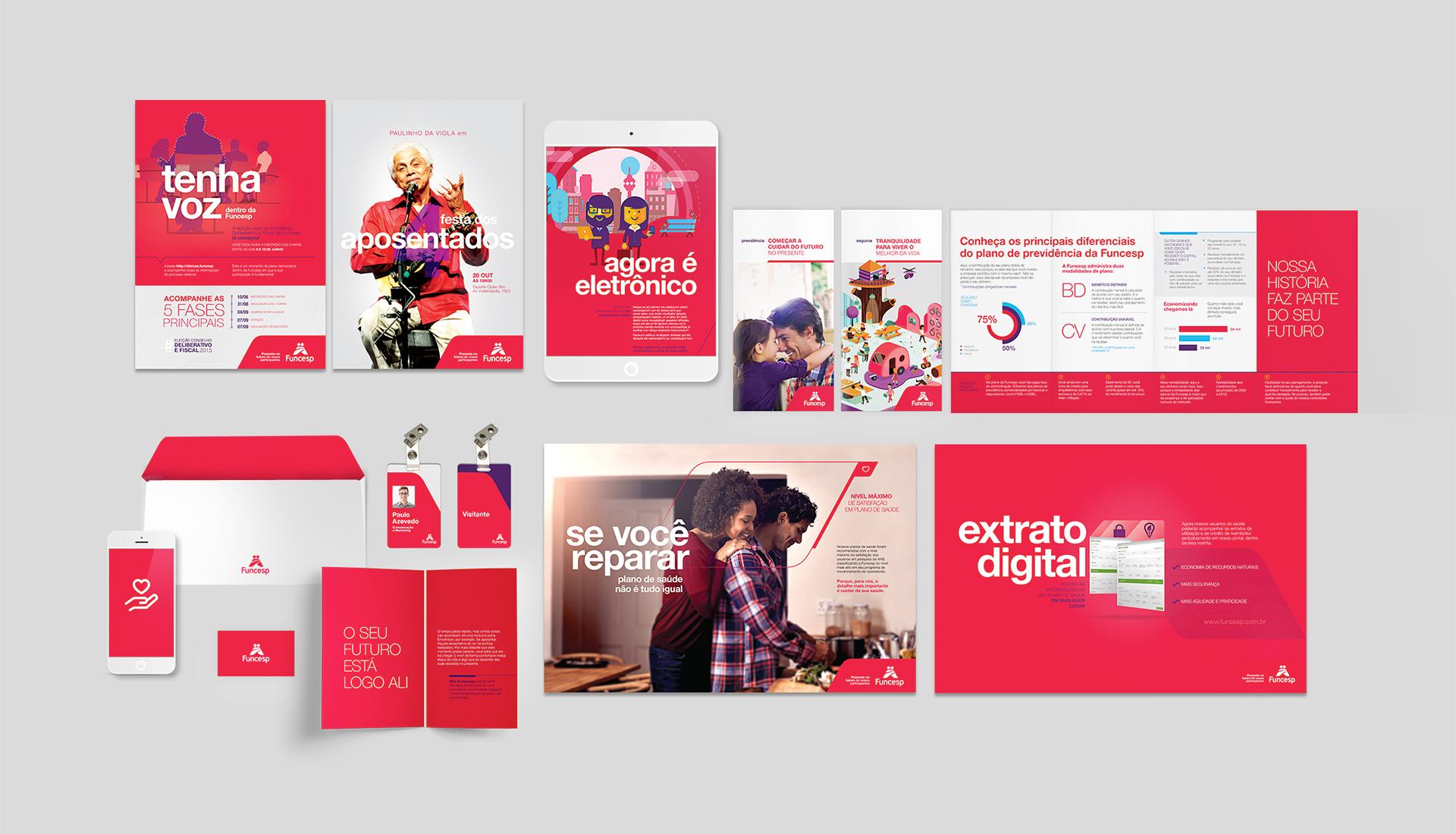
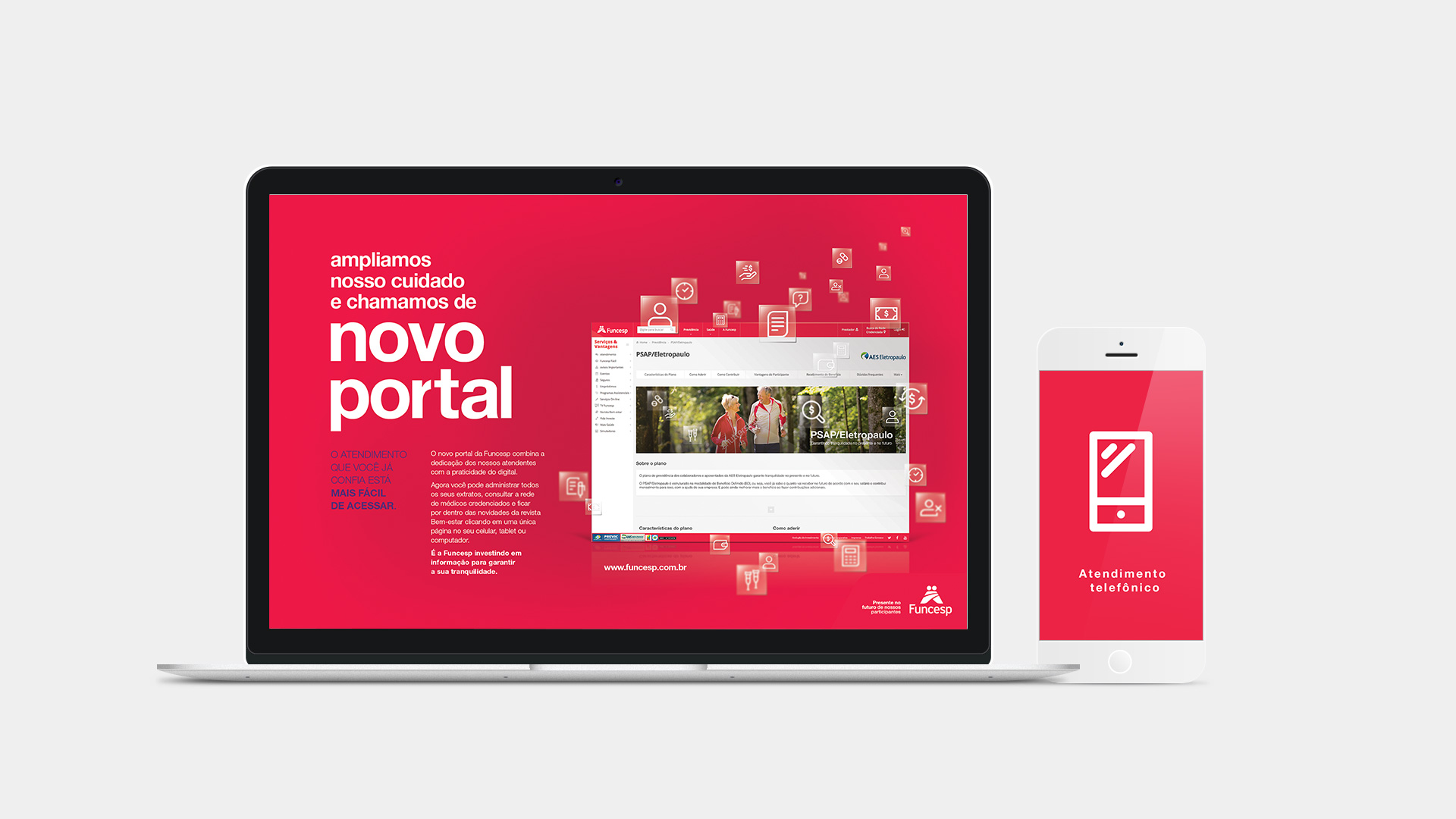
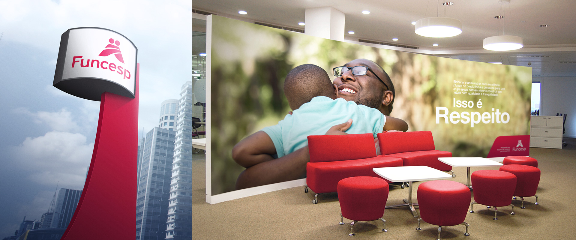
In 2009 we started working together with Funcesp, on restructuring all its communication to make it more effective and closer to its participants. It was a change that began from inside out and that beyond visual modernization, improved the customer service channels, created new products and media and changed all the contact points between the brand and its participants.
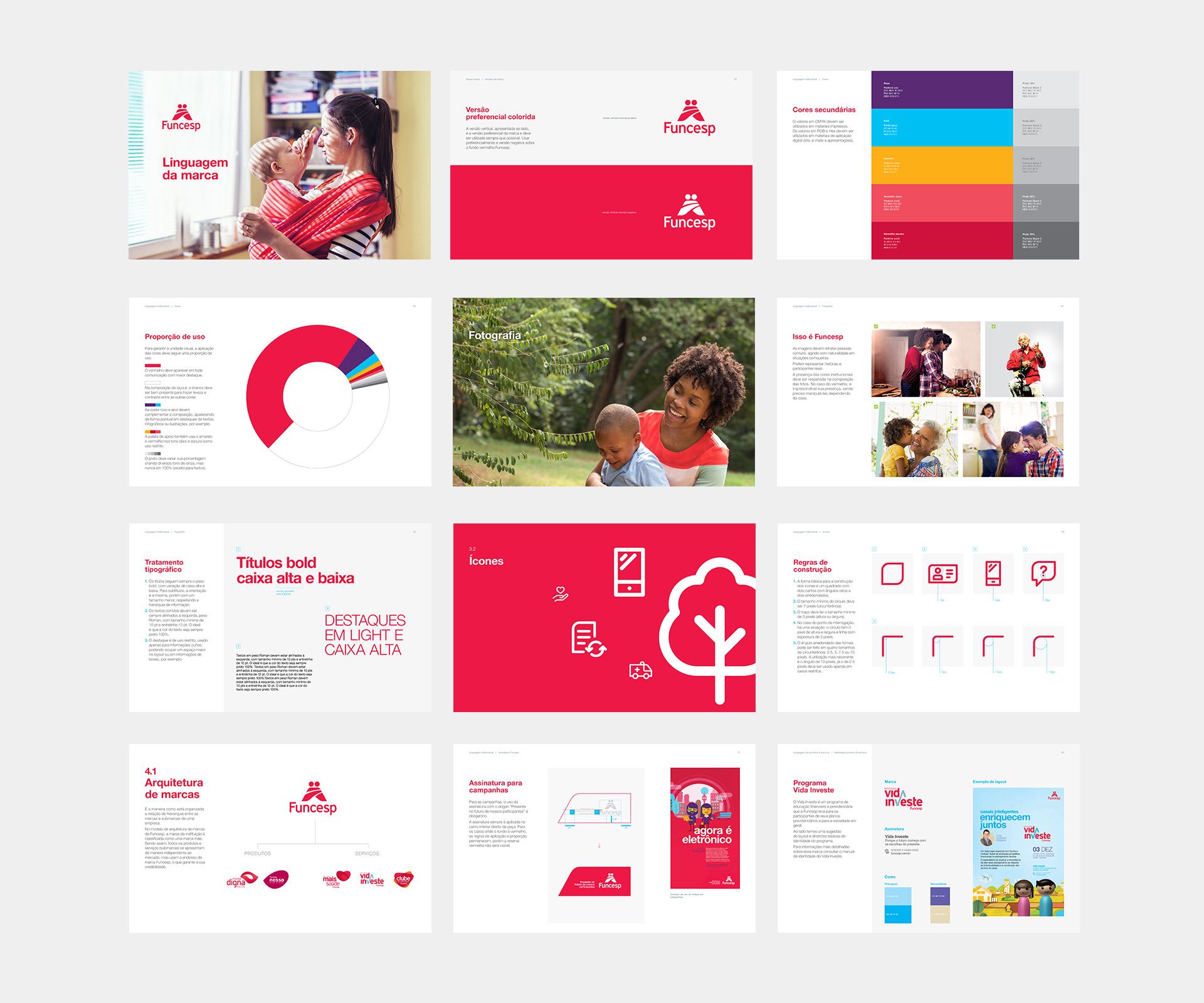
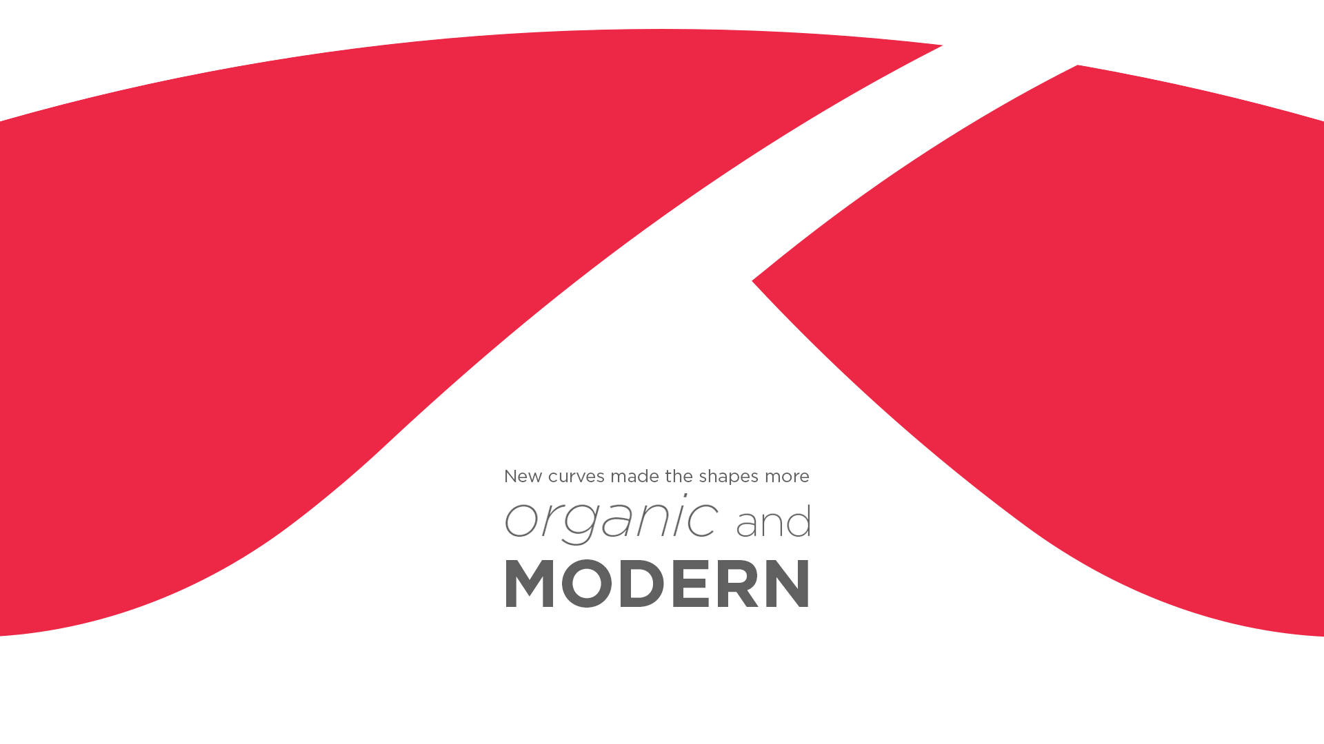
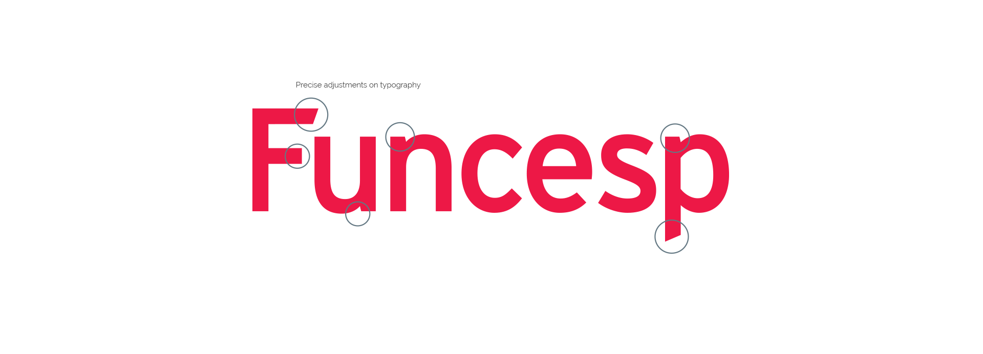
This new scenario pointed the necessity of modernization of the logotype so it could follow all the changes and be more aligned with the new perception of the brand by its publics.

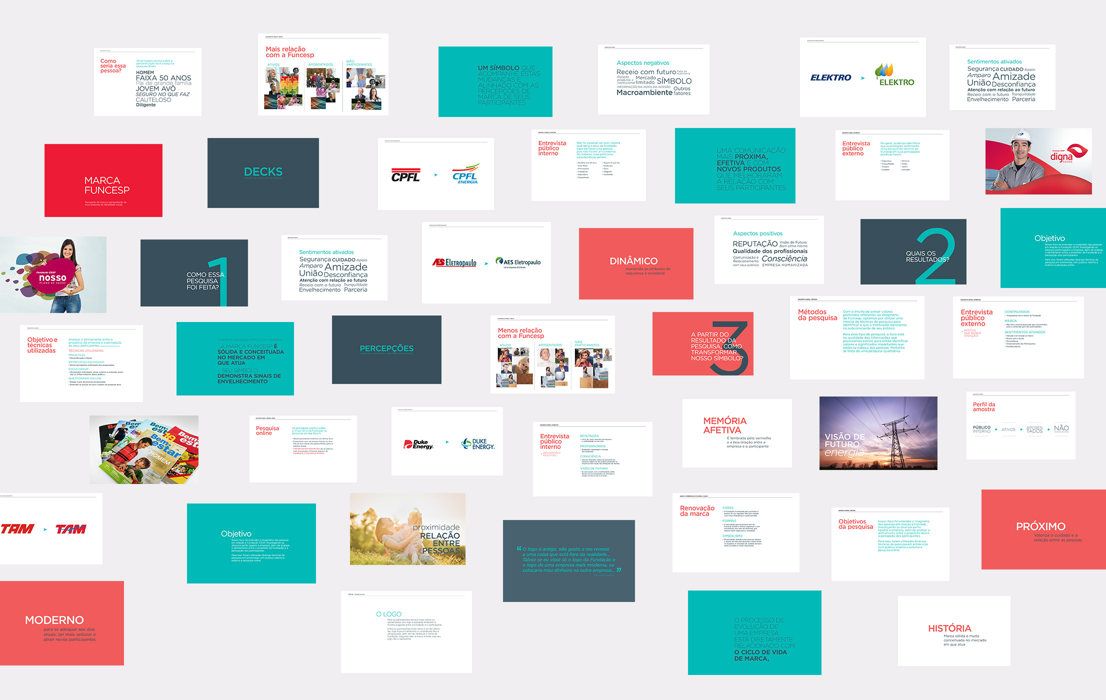
The research was essential to understand which were the perceptions of Funcesp’s many publics and identify what should be kept and what points should be improved in the new design.
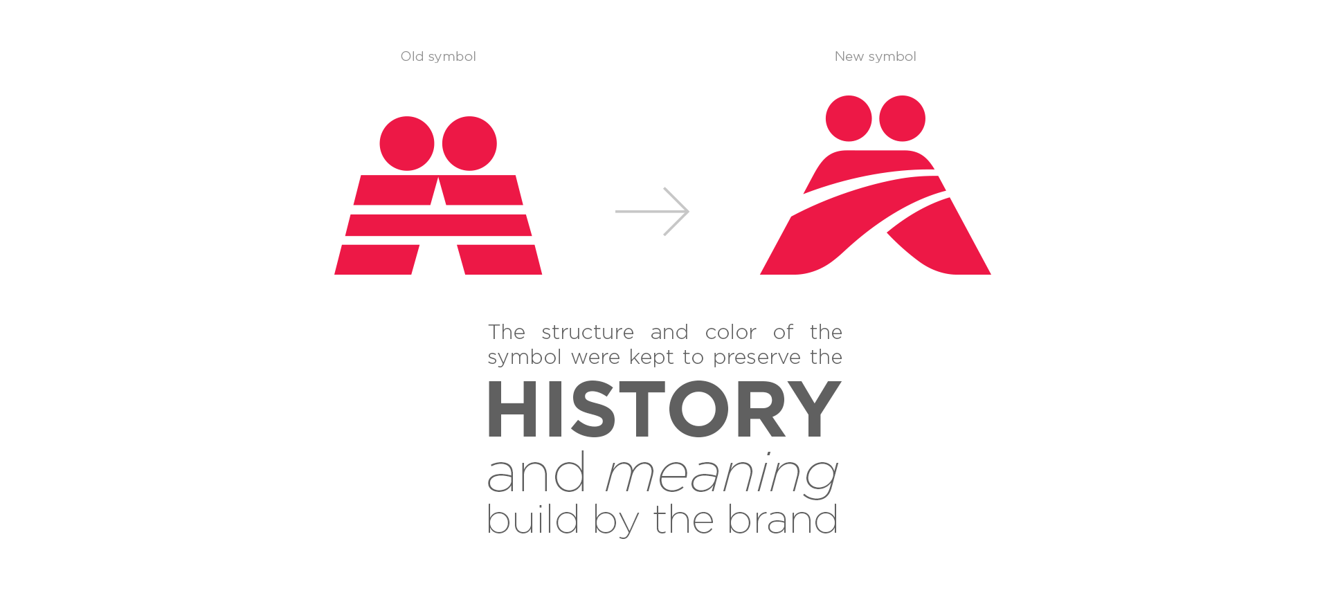
The brand should be modernized, but without losing its meaning.
The result showed that Funcesp is very solid and renowned in its field, but that its symbol showed signs of aging. From this result, were created concepts that guided the brand redesign.
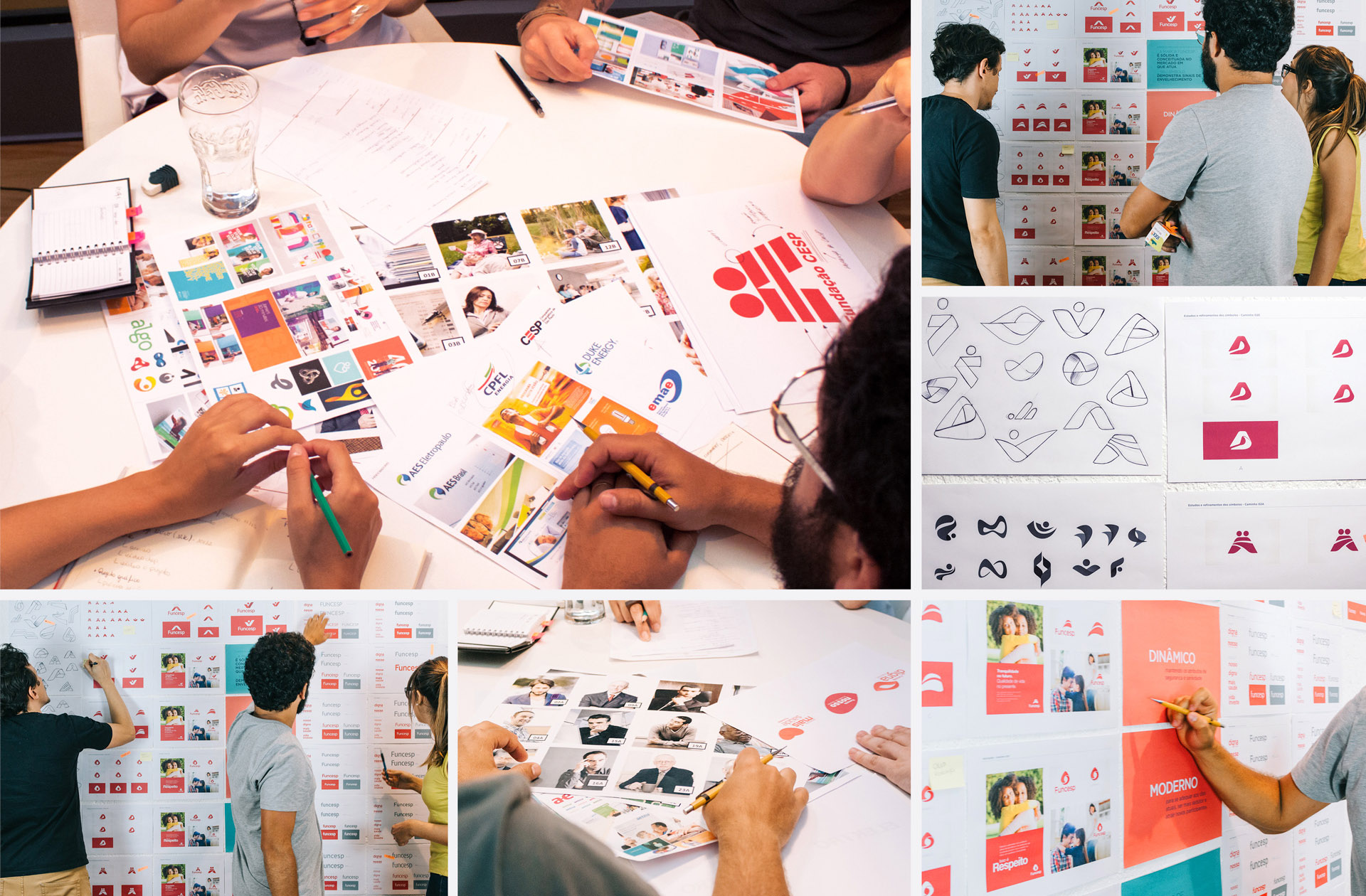
The challenge of this project would be to preserve all the brand’s history and meanings that are always present in the imaginary of its publics, and to strengthen its main qualities with a more modern, dynamic design, aligned with Funcesp’s new communication.

“It is clear as we look at the design of the brand that it was taken into consideration all aspects of redesign and modernization this brand needed and that we haven’t forgotten to reflect all the history it carries”